FLOWERY BRANCH — The Atlanta Falcons announced on Wednesday they will usher in the 2020 season with new uniforms as part of a comprehensive redesign for the first time in 17 years. The entire new array of uniform options includes elements of the Falcons’ past while updating the brand to match the modern progression of
Atlanta.
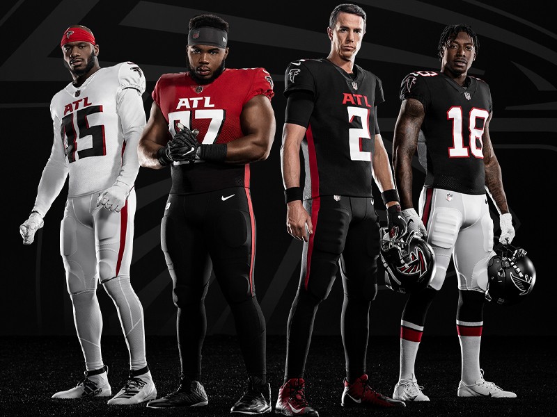
The new official Falcons home look will feature black jerseys and black pants with the away look going white on white. The uniform closet will now offer up to eight different color combinations, including the current throwback version paying homage to the 1966 team and a new “Rise Up” alternate uniform. The collection includes four jerseys (black home, white away, gradient alternate and the ’66 throwbacks), four pants (black, white, red and throwbacks) and one helmet (satin black).
BACKGROUND
Using nearly two decades of fan research collected from focus groups, online and through different social media platforms, as well as input by current and former Falcons players, the overwhelming plea was consistent: 1) Own red, but bring on the black, 2) reflect the modern progression of the city, and 3) keep it simple and stay true to
our roots.
Throughout continued conversations with fans and players, it was clear that the designs needed to reflect elements of the past and the present, the pride of Atlanta as well as the state-of-the-art design of Mercedes-Benz Stadium.
THE PROCESS
Conversations started inside the organization back in 2016 with the official process kicking off in January 2018. The Falcons embedded their internal design team together with the NFL and Nike to determine how best to bring the uniform and identity to life, and the result is clean, simple and intentional.
“We took a fan-first approach in gathering feedback and design input and have modernized the look of our team and our brand,” Falcons President Rich McKay said. “Black has been a part of our organization since we took the field in 1966 so we’ve stayed true to our roots and have given our fans and players what they’ve been asking for
over many years.”
“This process has been a true reflection of Arthur Blank’s core values -- listening and responding to our fans,” said Morgan Shaw Parker, the Falcons chief marketing officer. “The city has evolved, our stadium has evolved and we knew it was time to do the same with our brand.”
OWN RED, BUT BRING ON THE BLACK
Like the city of Atlanta, black evokes strength, power, grit … and a little bit of swagger. Black jerseys have been a part of Falcons history since they first took the field in 1966, during the original Dirty Bird era in the late 1990s, from 2003-08 and more recently as alternates or throwbacks, amplified by personalities like Deion Sanders, Jerry Glanville and Michael Vick to Matt Ryan and Julio Jones.
The color red reflects a shared sense of community in Atlanta as most of the major sports teams and many iconic homegrown brands share the color. Several signature elements across the new uniforms are highlighted in red including the familiar Falcons bird logo, the new ATL mark across the chest and the new stripe or “stoop”, down the side of the uniform. Red is also featured as a primary jersey color in the new gradient “Rise Up” alternate uniform.
Silver and gray have also been a part of the Falcons color palate for decades but will now play a more prominent role, incorporated into the helmet decal and the new silver facemask.
REFLECT THE MODERN PROGRESSION OF ATLANTA
Atlanta is known as much for diversity and culture as it is for innovation and creativity. From music and design to business and technology, the city of Atlanta influences everything. The Falcons have a proud tradition of bringing people together from all walks of life, so the new ATL mark is placed proudly and prominently across the chest of
the new uniforms as a reflection of a city constantly on the rise. A three-letter combination recognized around the world; it is only fitting the Falcons represent the ATL on a global stage.
The Falcons helmet has evolved from a traditional glossy look to a more modern all-black satin finish. The Falcon bird logo is nearly 30 percent larger than before with a chrome outline to compliment the new face mask. The “Rise Up” alternate uniform pays homage to our next generation of Falcons fans. The gradient pattern rising from black to red offers a fresh representation of a city constantly on the rise through a visual pattern made from the eye in the Falcon logo.
KEEP IT SIMPLE; STAY TRUE TO OUR ROOTS
The familiar, identifiable Atlanta Falcons wordmark has been tightened and sharpened for ease of use, while the new numbers boast a more modern typeface, a drop shadow and sharp terminals to match the angles of the current wordmark and primary Falcon bird logo.
The Atlanta Falcons primary logo was updated in 2003 and remains the same in 2020. It was derived from the original team logo dating back to the club’s debut in 1966. We’ve stayed true to our roots by keeping our colors and the Falcon bird intact – making it even more prominent than ever before but delivering a more modern design that reflects our team, our fans and this great city.
The stripe or “stoop” down the side of the uniform is a graphic extension taken directly from the wing on the Falcon logo, and the gradient pattern in the “Rise Up” Alternate uniform pattern is taken directly from the eye of the bird.
The 1966 throwback uniform has become an icon to both players and fans alike, and one that will remain a staple in the Falcons closet. The throwback decal adorns the helmet and the iconic red and black stripe pattern has been a consistent staple through several historical uniform designs.